Railing Designer
Redesign of CAD-adjacent software product
Introduction
Railing Designer is a CAD-adjacent app allowing users to quickly configure structures, with detailed parts breakdown, 2D and 3D views, and an accurate estimate of the cost they can make decisions with.
While it supports a limited set of tooling by default, Railing Designer is often heavily customized per customer to support complex pieces and configurations as needed.
I had some time between other projects, so took initiative to redesign the product.
Problems
Built and shipped primarily by engineers, the interface never really had a serious design pass, and the app had been pushed and grown in ways it wasn’t really designed for.
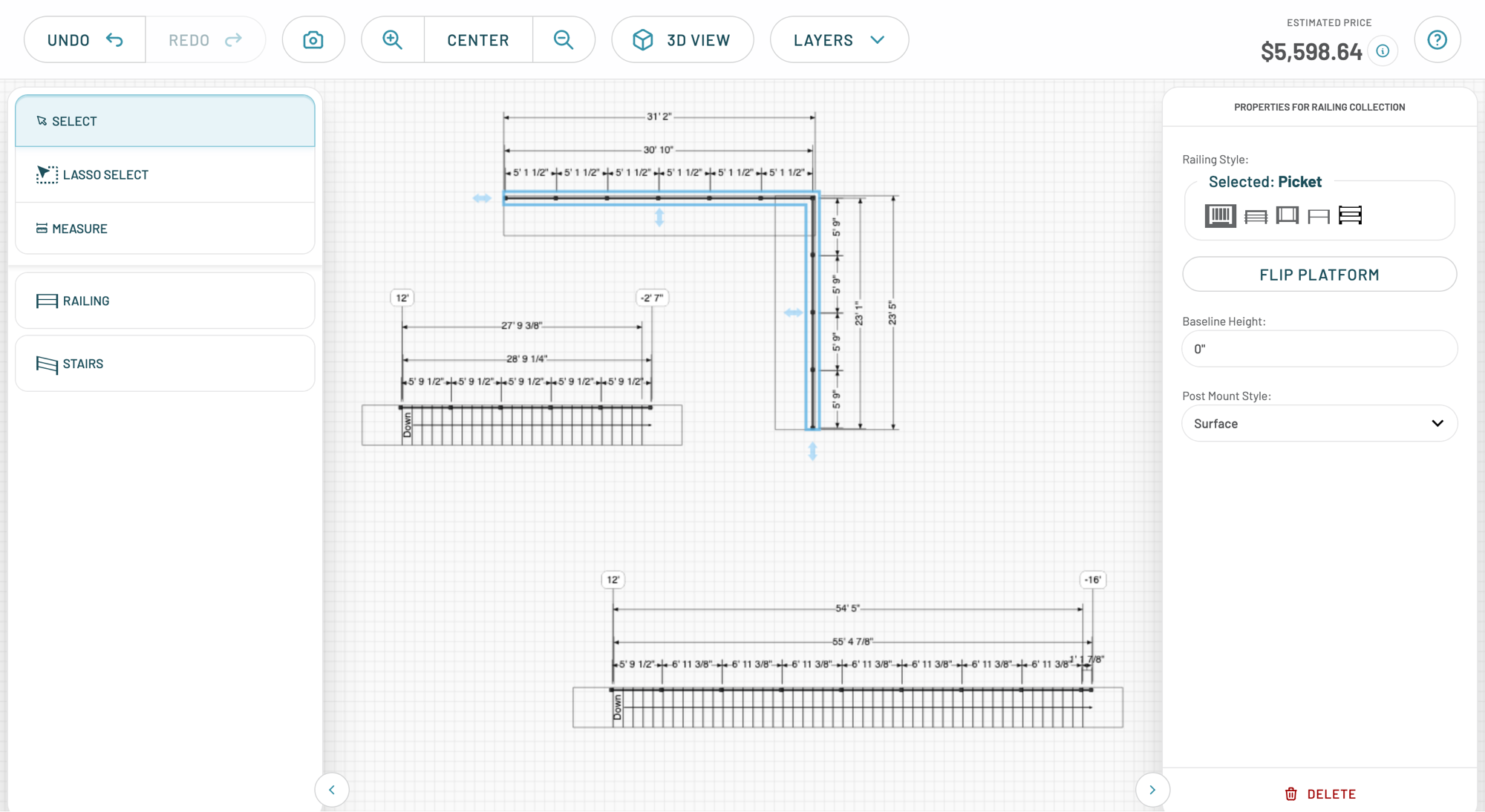
For existing customers or potential customers interacting with the free trial, I knew their experience was far below other similar apps.
- The UI was unwieldy and gigantic — unclear color usage, inconsistent icon libraries, mismatched font sizes, and a blurry canvas
- The code for the app came from three different repositories rendering things at least two different ways with many styling choices hard-coded
- Certain user flows were very high-friction and needed streamlining, and no analytics had been installed to capture how users were using or struggling with the software
Solutions
I spent a few days exploring visual directions for the design editor (and the requisite admin pages), then homed in on some prototypes I could show leadership.
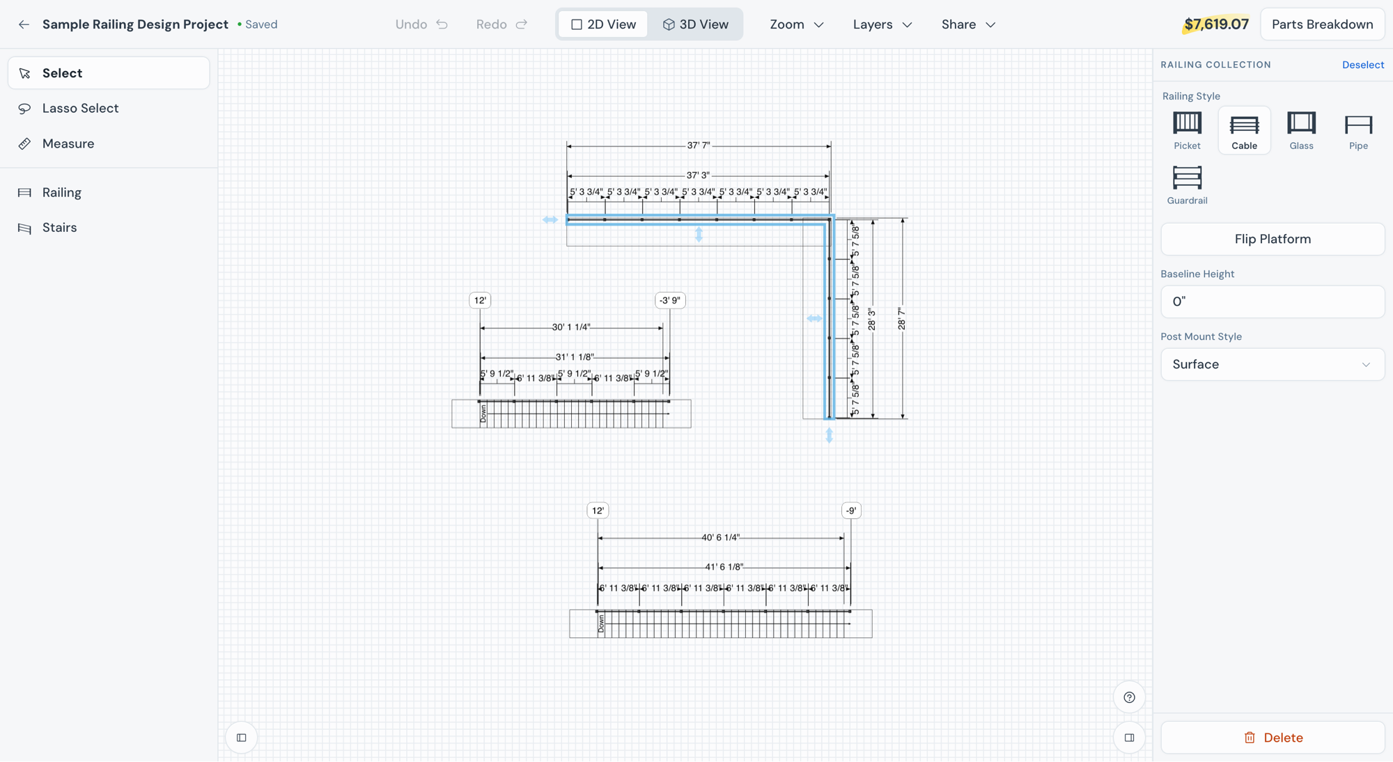
Sean, the project leader, quickly approved it. “I’ve just got a tour from Kyle Shepherd of a design refresh of DPQ. It is amazing!” I was given a second designer to help implement as well as an engineer for technical review.
Under my direction, we pushed out the work of implementing the redesign, streamlining codebase issues, and rethinking preexisting user flows. This redesign work is enabling conversations for additional ways to serve these customers.
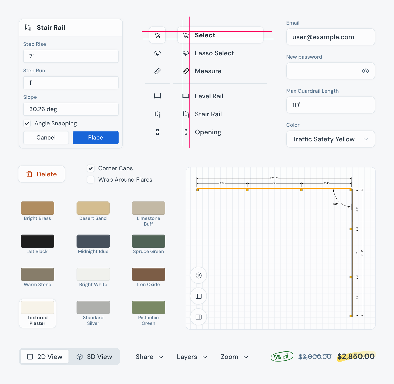
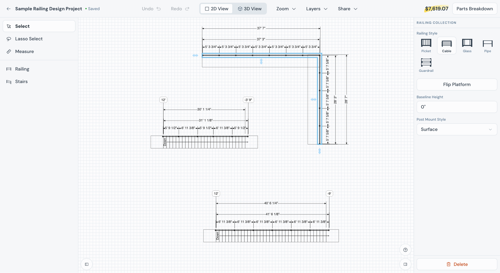
- The UI is now standardized and consistent — interface colors have been focused, icons standardized, font sizes unified, and the canvas rendering is sharp and crisp
- The code for the app still comes from three different repositories, but now the appropriate elements have been exposed for consistent and easier styling
- High-friction user flows have been revised, and analytics are being installed now so we can track product usage data